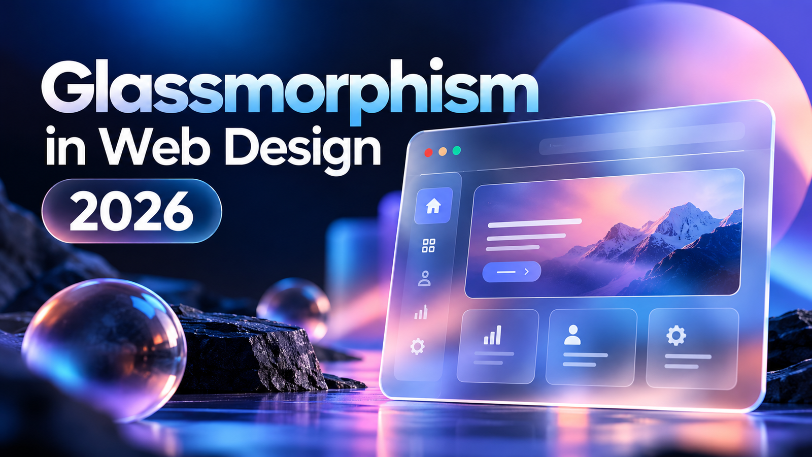
Glassmorphism in Web Design 2026: Trends, CSS & Best Practices
Glassmorphism has evolved from a visual trend into a practical UI design technique for creating depth, hierarchy, and a more immersive digital experience. In 2026, the style is no longer about putting a translucent blur effect on every card or section. Instead, modern glassmorphism focuses on controlled transparency, subtle blur, strong contrast, thoughtful layering, and performance-conscious implementation.
When used correctly, glassmorphism can make a website feel modern, premium, and interactive without relying on heavy graphics or complicated visual effects. When overused, however, it can make interfaces difficult to read, reduce accessibility, and introduce unnecessary rendering costs.
For developers and designers working on modern websites, the real question is not whether glassmorphism looks good. The better question is: where does glassmorphism improve the user experience, and how can it be implemented without sacrificing usability or performance?
What Is Glassmorphism in Web Design?
Glassmorphism is a UI design style that creates the appearance of translucent, frosted-glass surfaces placed over a colorful or visually rich background.
A typical glassmorphism component combines several visual properties:
- Semi-transparent background
- Background blur
- Subtle border
- Soft shadow
- Layered depth
- Controlled color or gradient
- Clear visual separation between interface layers
background, backdrop-filter, border, and box-shadow.
The important distinction is that glassmorphism is not simply a transparent background. The characteristic frosted appearance comes from the interaction between transparency and the content behind the element.
Modern browsers support the CSS backdrop-filter property across current browser versions, making this type of effect considerably more practical for production websites than it was several years ago.
Why Is Glassmorphism Still Relevant in 2026?
Design trends often disappear when they become repetitive. Glassmorphism has survived because its underlying visual principles—depth, layering, transparency, and hierarchy—remain useful in interface design.
The 2026 approach is more refined.
Instead of:
“Make everything look like glass.”
The better approach is:
“Use glass where it communicates hierarchy or creates useful visual separation.”
This shift makes glassmorphism more suitable for real websites.
A frosted navigation bar can separate navigation from a colorful hero image. A glass card can highlight a primary feature. A translucent modal can visually establish a layer above the page. A dashboard can use subtle glass surfaces to distinguish controls from data visualization.
Current 2026 design discussions similarly emphasize using glassmorphism selectively rather than applying blur to every component.
The Core Elements of a Glassmorphism Interface
1. Transparency
Transparency allows some of the background to remain visible through the interface.
A common starting point is a semi-transparent background such as:
background: rgba(255, 255, 255, 0.12);The exact opacity should depend on the background and the content inside the component.
Too much transparency can make text difficult to read. Too little transparency can make the component look like an ordinary solid card.
The goal is controlled translucency.
2. Background Blur
The defining feature of the frosted-glass appearance is background blur.
A basic implementation looks like:
backdrop-filter: blur(12px);
-webkit-backdrop-filter: blur(12px);
Unlike a normal filter: blur(), backdrop-filter affects the area behind the element rather than simply blurring the element's own contents.
This creates the characteristic soft background distortion associated with glassmorphism.
3. Subtle Borders
A thin border helps define the edges of a translucent component.
For example:
border: 1px solid rgba(255, 255, 255, 0.25);Without an edge definition, a transparent card can visually disappear into its background.
The border should remain subtle. A heavy solid border usually defeats the purpose of the effect.
4. Soft Shadows
A restrained shadow can add another layer of depth:
box-shadow: 0 8px 30px rgba(0, 0, 0, 0.12);The objective is not to make the component appear physically raised several centimeters from the page. The shadow should simply help establish hierarchy between layers.
5. A Strong Background
Glassmorphism works best when there is something interesting behind the glass.
Suitable backgrounds include:
- Gradients
- Abstract shapes
- Product imagery
- Photography
- Color transitions
- Animated backgrounds
- Dark futuristic interfaces
A Simple Glassmorphism CSS Example
A basic production starting point can look like this:
.glass-card {
    background: rgba(255, 255, 255, 0.12);
    backdrop-filter: blur(12px);
    -webkit-backdrop-filter: blur(12px);
    border: 1px solid rgba(255, 255, 255, 0.25);
    border-radius: 20px;
    box-shadow: 0 8px 30px rgba(0, 0, 0, 0.12);
}
This should be treated as a starting point rather than a universal recipe.
The correct opacity, blur radius, border strength, radius, and shadow should be adjusted according to the surrounding design.
Where Glassmorphism Works Best
Glassmorphism can be particularly effective when it supports the structure of an interface.
Hero Sections
A glass card placed over a colorful hero background can contain:
- Headline
- Short description
- CTA
- Product information
- Statistics
- Service highlights
Navigation Bars
A translucent sticky header can create a sense of continuity as users scroll through a page.
This is especially effective when the page contains rich imagery, gradients, or dark backgrounds.
SaaS Dashboards
Dashboards can benefit from subtle glass surfaces for:
- Statistics cards
- Filters
- Navigation panels
- Notifications
- Profile menus
- Floating controls
Creative Portfolios
Creative developers and designers can use glassmorphism to demonstrate interaction and visual hierarchy.
A portfolio can combine:
- Glass cards
- Gradient backgrounds
- Motion
- Large typography
- Interactive transitions
- Layered imagery
Modals and Overlays
Glass effects can help distinguish a modal or floating panel from the page underneath it.
This creates a clear visual relationship between the active interface and the underlying content.
When Glassmorphism Should Be Avoided
Glassmorphism is not appropriate for every component.
If a page contains long paragraphs, complex tables, dense forms, or critical information, excessive transparency can make the interface harder to understand.
It can also be problematic when:
- Background imagery is very busy
- Text contrast is weak
- Too many components use blur
- Mobile performance suffers
- Users need to scan information quickly
- The design relies on visual effects instead of hierarchy
Sometimes a simple solid background is the better design decision.
Glassmorphism and Accessibility
Accessibility should be considered before adding visual effects.
The biggest issue is text contrast.
A glass panel may look readable against one background position and become difficult to read when the content behind it changes.
For example, white text might look excellent over a dark blue area but become almost invisible when a bright image moves underneath the same panel.
Therefore, contrast should be tested against the actual rendered interface rather than only against the intended background color.
A practical approach is to increase the opacity of the glass surface when necessary:
background: rgba(255, 255, 255, 0.18);If that still does not provide sufficient contrast, use a more opaque background.
The visual effect should never take priority over readable content.
Add a Fallback for Unsupported or Reduced Effects
Glassmorphism should be treated as progressive enhancement.
The content should remain usable even when blur effects are unavailable.
For example:
.glass-card {background: rgba(20, 20, 30, 0.88);}@supports (backdrop-filter: blur(12px)) {.glass-card {background: rgba(255, 255, 255, 0.12);backdrop-filter: blur(12px);-webkit-backdrop-filter: blur(12px);}}
This approach ensures that the component still has a readable surface if the blur effect cannot be rendered.
Does Glassmorphism Affect Website Performance?
It can.
The backdrop-filter property can introduce additional rendering work, particularly when several large elements use blur simultaneously. MDN notes that backdrop-filter applies graphical effects to the area behind an element, which is precisely what creates the visual effect but also makes the rendering more involved than a simple background color.
Performance becomes particularly important on mobile devices.
Instead of applying a large blur to every card, consider:
- Using fewer glass elements
- Keeping blur values moderate
- Avoiding unnecessary full-screen blur
- Testing on real mobile devices
- Reducing effects on smaller screens
- Keeping animations lightweight
- Measuring Core Web Vitals after implementation
Glassmorphism on Mobile Websites
Mobile requires additional consideration because screen space is limited.
A glass card that looks spacious on desktop can become visually crowded on a phone.
Responsive glassmorphism should therefore consider:
Smaller blur values
You may not need the same blur intensity on mobile.
Stronger backgrounds
Increasing background opacity can improve readability on smaller screens.
Fewer layers
Avoid stacking multiple translucent panels over one another.
Simpler animation
Motion combined with multiple blur layers can increase rendering complexity.
Your responsive web design should preserve the hierarchy of the interface even when some decorative effects are reduced.
For broader responsive development considerations, see the Responsive Web Design service.
Glassmorphism vs. Traditional Card Design
Traditional cards generally use a solid background:
background: #ffffff;Glass cards introduce transparency and background interaction:
background: rgba(255, 255, 255, 0.12);
backdrop-filter: blur(12px);
The traditional approach provides predictable contrast and simpler rendering.
Glassmorphism provides more visual depth but requires more careful design and testing.
Neither approach is automatically better.
The right choice depends on the purpose of the component.
Glassmorphism vs. Neumorphism
Glassmorphism and neumorphism are sometimes grouped together because both became popular around the same era, but they create very different visual experiences.
Glassmorphism focuses on:
- Transparency
- Blur
- Layering
- Background visibility
- Frosted surfaces
- Soft shadows
- Extruded surfaces
- Low-contrast elements
- Light and dark shadow pairs
Glassmorphism and Other 2026 Design Trends
Glassmorphism does not need to exist by itself.
It can work alongside other modern design approaches such as:
- Bento-style layouts
- Large typography
- Subtle motion
- Micro-interactions
- Gradient backgrounds
- 3D elements
- Dark-mode interfaces
- Interactive storytelling
Combining five different trends simply because they are popular can create a confusing interface. A stronger design chooses a visual language and uses supporting techniques selectively.
For example, a portfolio might combine a dark background, large typography, subtle glass cards, and restrained motion. The glass effect becomes one part of the system instead of becoming the entire identity of the website.
How to Implement Glassmorphism Responsibly
A practical implementation process can be broken into seven steps.
Step 1: Start With the Layout
Build the structure without the glass effect first.
Make sure the content hierarchy works.
Step 2: Identify the Important Layers
Choose only the components that benefit from a translucent surface.
Step 3: Add Transparency
Start with a low-opacity background.
Step 4: Add Blur
Introduce backdrop-filter gradually rather than starting with an extreme blur.
Step 5: Define the Edge
Add a subtle border and shadow.
Step 6: Test Contrast
Check headings, body copy, buttons, icons, and interactive elements against changing backgrounds.
Step 7: Test Performance
Check desktop and mobile performance before launch.
If the interface remains readable and responsive without the effect, you have created progressive enhancement rather than dependency.
Glassmorphism for Modern Business Websites
Glassmorphism can also be useful outside portfolios and experimental interfaces.
For a business website, it can be applied to:
- Hero CTA panels
- Service cards
- Pricing highlights
- Navigation
- Testimonials
- Contact sections
- Feature comparisons
For example, a service page should make the service, benefits, proof, and CTA easy to understand. Decorative effects should support that journey rather than compete with it.
If you are planning a custom website, you can explore blank" rel="noopener noreferrer" class="text-primary dark:text-sky-400 hover:underline font-semibold">custom web application development or website design depending on the project requirements.
Should You Use Glassmorphism in 2026?
Glassmorphism remains a useful design technique in 2026, but its value comes from how strategically it is used, not from simply following a trend.
The strongest implementations treat glass as a material within a larger design system.
Use it when it helps:
- Establish visual hierarchy
- Separate interface layers
- Create depth
- Highlight important components
- Improve the visual character of a digital product
- Reduces readability
- Creates excessive visual noise
- Slows down interactions
- Makes navigation confusing
- Complicates important forms or data
Final Thoughts
Glassmorphism in web design has matured significantly.
What started as a visually distinctive UI trend has become another tool available to designers and developers. In 2026, the most effective approach is not to cover an entire website in translucent panels. Instead, use glassmorphism selectively, maintain strong contrast, keep the interface responsive, and measure performance before launch.
The technical implementation is relatively simple. The difficult part is knowing where the effect belongs.
A well-designed glass interface should still work when the blur is removed. If the content becomes confusing without the effect, the design probably needs stronger underlying hierarchy.
Ultimately, good glassmorphism is not about making a website look futuristic. It is about using transparency, depth, and layering to make the interface more engaging while keeping it usable, accessible, and fast.
Frequently Asked Questions
What is glassmorphism in web design?
Glassmorphism is a UI design style that uses translucent surfaces, background blur, subtle borders, and shadows to create a frosted-glass appearance.
Is glassmorphism still popular in 2026?
Yes. Glassmorphism continues to appear in modern interfaces, but its 2026 implementation is generally more selective and performance-conscious rather than applying the effect to every component.
How do you create glassmorphism with CSS?
The effect can be created using a semi-transparent background, backdrop-filter: blur(), a subtle border, and a soft shadow. The exact values should be adjusted according to the background and content.
Is glassmorphism good for accessibility?
It can be, but it requires careful contrast testing. Transparency and changing backgrounds can make text difficult to read, so solid or more opaque fallbacks may be necessary.
Does glassmorphism slow down websites?
Heavy use of backdrop-filter can increase rendering work. Limiting the number of blurred elements, reducing blur intensity, and testing performance on mobile devices can help.
Where should glassmorphism be used?
It works well for selected hero sections, navigation bars, dashboards, overlays, creative portfolios, and feature cards. It should be used more carefully for dense text, complex forms, and data-heavy interfaces.
What is the difference between glassmorphism and neumorphism?
Glassmorphism uses transparency and background blur to create frosted surfaces, while neumorphism relies mainly on soft shadows and low-contrast surfaces to create an embossed appearance.
What is the biggest mistake when using glassmorphism?
The biggest mistake is applying the effect everywhere. Excessive transparency and blur can reduce readability, weaken hierarchy, and hurt performance.